A Splash of Colour
When giving a presentation, it’s difficult to present ideas in science or mathematics without the use of equations. It’s possible, but unless you’re exploring a geometry problem, you’re probably out of luck. If you want to get a message across to your audience that is more substantive than a bunch of emphatic adjectives about science, you need to use equations.
Unfortunately, equations in presentations don’t have a habit of looking (How shall we say it?) nice. Instead, they are either crammed in beside plots of data or formatted in a way that makes them difficult for even scientists to decode. It sometimes makes me wonder if scientists spend all of their time on research and forget that it’s important to make things presentable for others.

It doesn’t have to be this way. In particular, I’ve learned that we can make equations much more readable when giving a presentation. It’s a small change that makes a big difference, allowing your audience to follow the equations without getting lost. (And let’s be honest. Getting lost happens a lot when listening to presentations!)
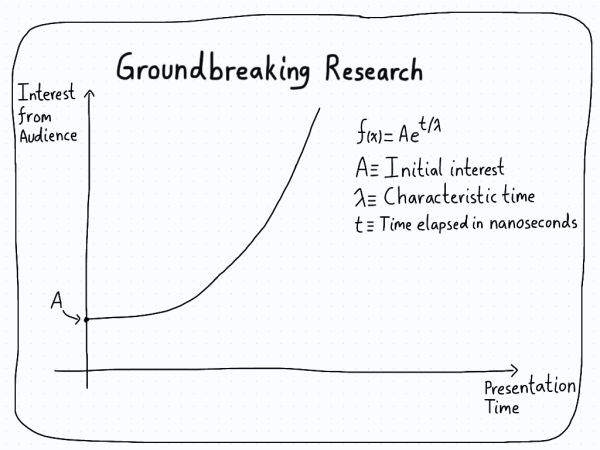
Let’s pretend you have a slide that looks like this.

There’s nothing particularly wrong with the slide. However, everything is neutral, which means that no elements jump out at the audience. The equation is there with all of the variables defined, but everything has the same emphasis. This could be made a lot better.
First, if you’re anything like me, you enjoy a classic colour pallet of black and white. You feel at home with the pre-colour era of media, and find there’s nothing wrong with black and white newspapers. If this resonates with you, don’t worry. I feel the same way. However, this isn’t the same century, and we’ve been able to add actual colour to our presentations. As such, we’re going to do something that might seem absurd, childish, or even (gasp!) unprofessional.
We’re going to colour the equations.
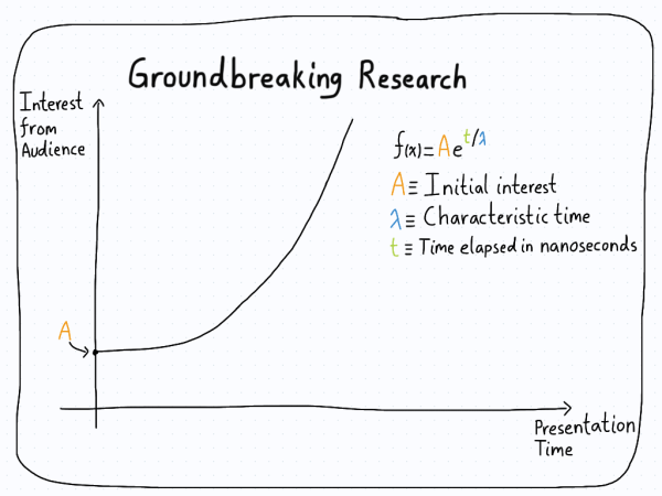
You heard me right. Even worse, I’m not talking about changing the colour of the equation from black to blue. I’m talking about changing the colour of each individual variable. If we take the slide from above and put it through a colour transformation, we might get something like this.

The advantage of this slide is clear. Instead of a neutral equation with the variables explained, the additional bit of colour gives the audience a connection between the variable and it’s definition. The connection is clearer, with the colours guiding the eye without needing to read.
“But wait,” you say. “I don’t want to turn my slides into a kaleidoscope of colour!”
I share your concern. Thankfully, we have this wonderful area of art called colour theory which deals with exactly this problem. By using an appropriate colour palette (such as the one from  ), you can make your slides look just as good as they did in black and white. Plus, you get the additional benefit that the audience can locate objects of interest on your slides with less difficulty. Which, in the end, is what we want.
Presentations are an important part of getting your groundbreaking research into the public eye. Unfortunately, a lot of presentations include slides with equations that can seem impenetrable. By adding colour, not only do you ease the separation of an equation into its components, but you also get the nice bonus of making your slides more friendly.
What more could you want?