Data Has a Friction Problem
As a runner, I could tell you things about my town that few others would know. I could describe the best homes for glorious views of the sunrise. I could tell you about our street lights based on the bubbles of light I see on dark mornings. I could show you the terrible (and sometimes non-existent) shoulders for cyclists, runners, and walkers from having to navigate them. I could even tell you when my town is spreading gravel from the tactile experience of having rocks dig into the soles of my shoes.
If I only drove around my town, I wouldn’t go past most homes, my headlights would mask the darkness of missing streetlights, my winter tires would grip most icy roads, and the gravel would be such a minor sensation that I would barely notice it.
Running gives me a detailed window into my town, but it’s a narrow one. What I know about traffic, for example, only applies to the early morning on my usual route. If I tried to generalize my experience to my region, province, or country, the narrow window would transform into the tiny glazed windows you find in public restrooms, which block out all details.
As Max Roser, the founder of Our World in Data, writes in his essay “The limits of our personal experience and the value of statistics”, “It’s tempting to believe that we can simply rely on personal experience to develop our understanding of the world. But that’s a mistake.” Instead, he suggests that, “To see what the world is like, we need to rely on other means: carefully-collected global statistics.”
But Roser doesn’t stop there. He points out that even making a huge effort to talk with a bunch of people every single day doesn’t make a huge dent in the problem. You will slightly expand the potential experience vista, but there are still so many perspectives that will be invisible to you.
News also informs our worldview, so in theory we could expand our horizon by learning about events from outside our life. But have you ever seen the news!? Roser puts it well:
“The news reports on the unusual things that happen on a particular day, but the things that happen every day never get mentioned. This gives us a biased and incomplete picture of the world; we are inundated with detailed news on terrorism but hardly ever hear of everyday tragedies like the fact that 16,000 children die every single day. … The problem is not so much what the news media covers but what it does not cover. Those left in darkness are often poor and powerless and geographically far from us. What we see in the news is not nearly enough to understand the world we are living in.”
Statistics correct the distortion of our personal experience to give us a clear view of our world. Roser’s point is that we should therefore value statistics just as much as our personal experience to inform our worldview.
Roser’s essay focuses on the value of statistics, which I agree is important. I value statistics a lot, and I think others should too! But Roser only briefly touches on the current challenges in obtaining and understanding statistics as an end user: “These statistics exist, but they are often neither accessible nor understandable. They are buried in spreadsheets, hidden behind paywalls, and presented in academic jargon.” I think these challenges are critical to valuing statistics and worth honing in on.
When I recently wrote about infrastructure, I recounted the 1998 ice storm that incapacitated a huge swath of my province’s electrical grid. While I was writing that piece, I wanted to know: How many homes used electrical heating in Québec at the time?
A simple question, right?
I first read a report by StatCan Plus and learned that roughly 65% of Québec households use electricity as their primary energy source (through baseboard heaters and radiant heating). I then clicked through to the data, figured out how to customize my query to Québec, and then saw this:
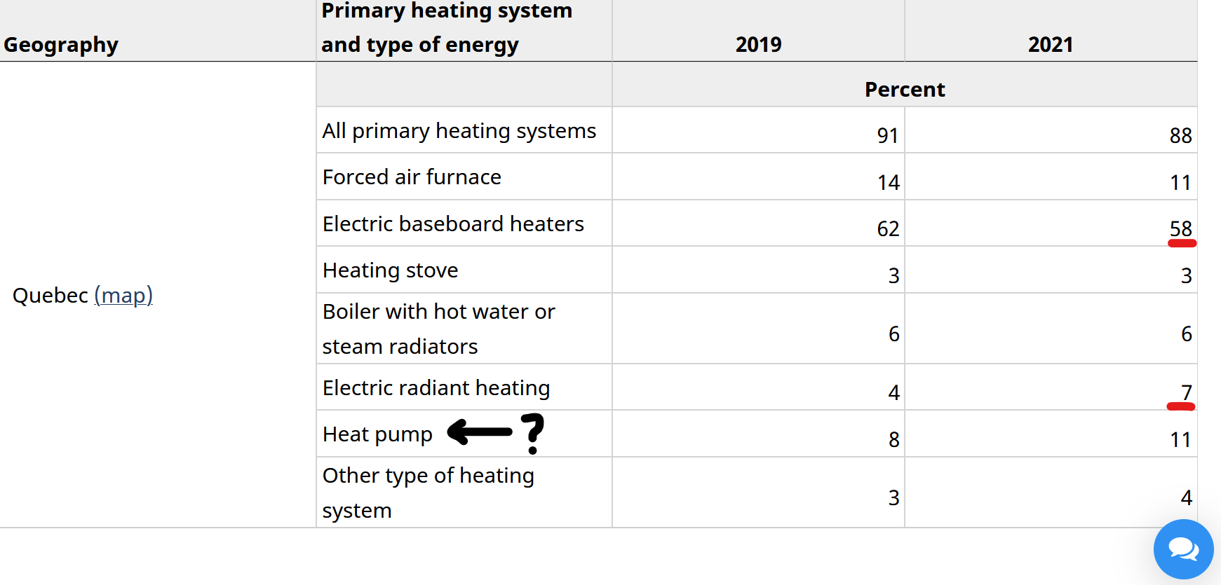 Primary heating source for Québec households. Source
We can see that for 2021, the two numbers do indeed add to 65%. But what’s going on with the “heat pump” row? I know they can be electric; I have one! So why isn’t it part of the total? I had no clue.
I learned that this data comes from the Households and the Environment Survey. Within it I found the variable “Heating system energy type of dwelling, category”. Seemed promising, so I read the whole text. But it was a waste of my time; it’s not discussing heating systems at all, just distinguishing different types of dwellings. I looked around for a few more minutes before giving up.
I went down a rabbit hole for this simple question, and found a partial answer and more questions. And thankfully I was able to find data at all. Navigating the StatCan website can be tricky at times, but in my mind it’s better than finding which of the 13-ish agencies in the US have the particular data I’m interested in. And it’s way better than coming across a $169 USD/month paywall from Statista.
How often do you think people will put in all this work to locate, access, understand, and interpret the data?
I persisted to find this data for my essay, yet I still wanted to give up! While I agree with Roser that we need to increase the value of statistics, I think we need to massively reduce the effort in obtaining them. Each point of friction is an invitation to abandon the search.
If we don’t, then is it so surprising that people turn to their personal experience? It’s always there, there’s no paywall, it will confirm their beliefs, and it requires little effort. That sounds like a winning combination to me.
In my view, to increase the value of statistics we need to make data easier to work with for the typical person. That suggests two pillars of action: teach data literacy (how to find, interpret, and understand data using statistics) and make our current datasets much more accessible.
The former is a more idealistic suggestion, but I think it’s worth mentioning. Working with data isn’t easy. Apart from statistical skills, you also need to know where to look, what to look for, and how to question data. I personally think this could start in primary and secondary school. Imagine a few classes where students ask questions and learn to answer them by finding and wrestling with data sources. This would teach students more than basic probability, but also how to dive deeper into the uses and limits of data.
The practical action we can take is to make data easier to access. Our World in Data does an excellent job of this; I have mixed feelings about my governments’ websites. Though I do like the articles on StatsCAN Plus, I find the whole site confusing at times to navigate. For my provincial government, they treat French as the only first-class citizen, increasing the barriers for non-French speakers. Just look at the English page for our population:
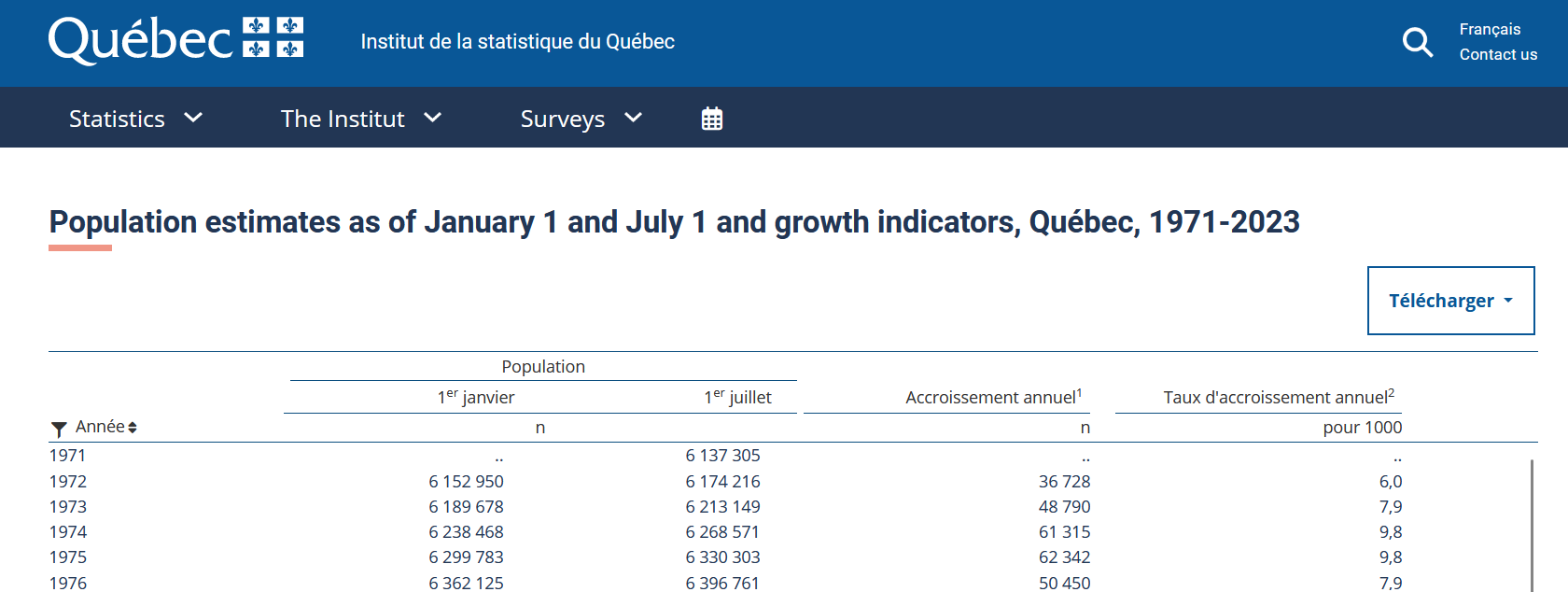 There’s an awful lot of French for the English version. Source
I appreciate that governments have a ton of data and designing a repository is challenging and perhaps not high on their priority list. That’s where non-profit organizations like Our World in Data could come in. They’ve shown how it’s possible to take data from all over the world and present it in a way that’s accessible and beautiful. Our World in Data focuses on pressing global problems, but I’d love to have the same care and attention to data at smaller scales and other topics. What would it take to have My Province in Data? Relative to overhauling the entire government website, some funding and the right individuals could make just as much of an impact in increasing data accessibility.
My colleague Maxwell Tabarrok suggests an analogy to supply and demand. Roser’s framing is about increasing the demand for statistics, raising its value relative to news media and personal experience. Though I agree demand is important, I’m arguing for the supply side: I find it difficult to imagine people valuing statistics if accessing them is an exercise in frustration. We need to remove the friction of finding, accessing, and interpreting data. Once we do, I think more people will be able to appreciate how statistics is the spell that expands our horizon of personal experience into a more representative worldview.
Thanks to Max Tabarrok, Rob Tracinski, and Tommy Dixon for feedback on drafts of this essay.
Endnotes